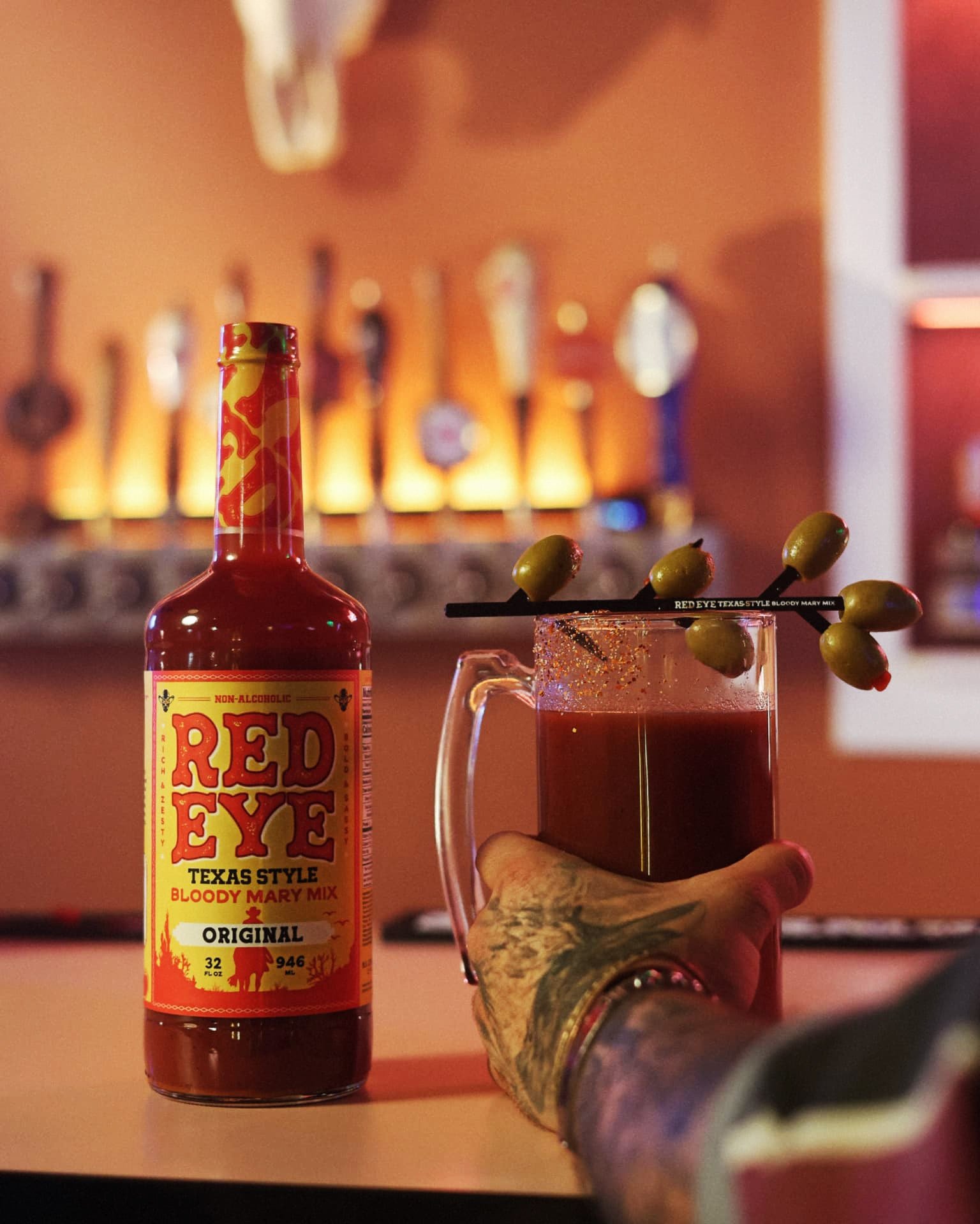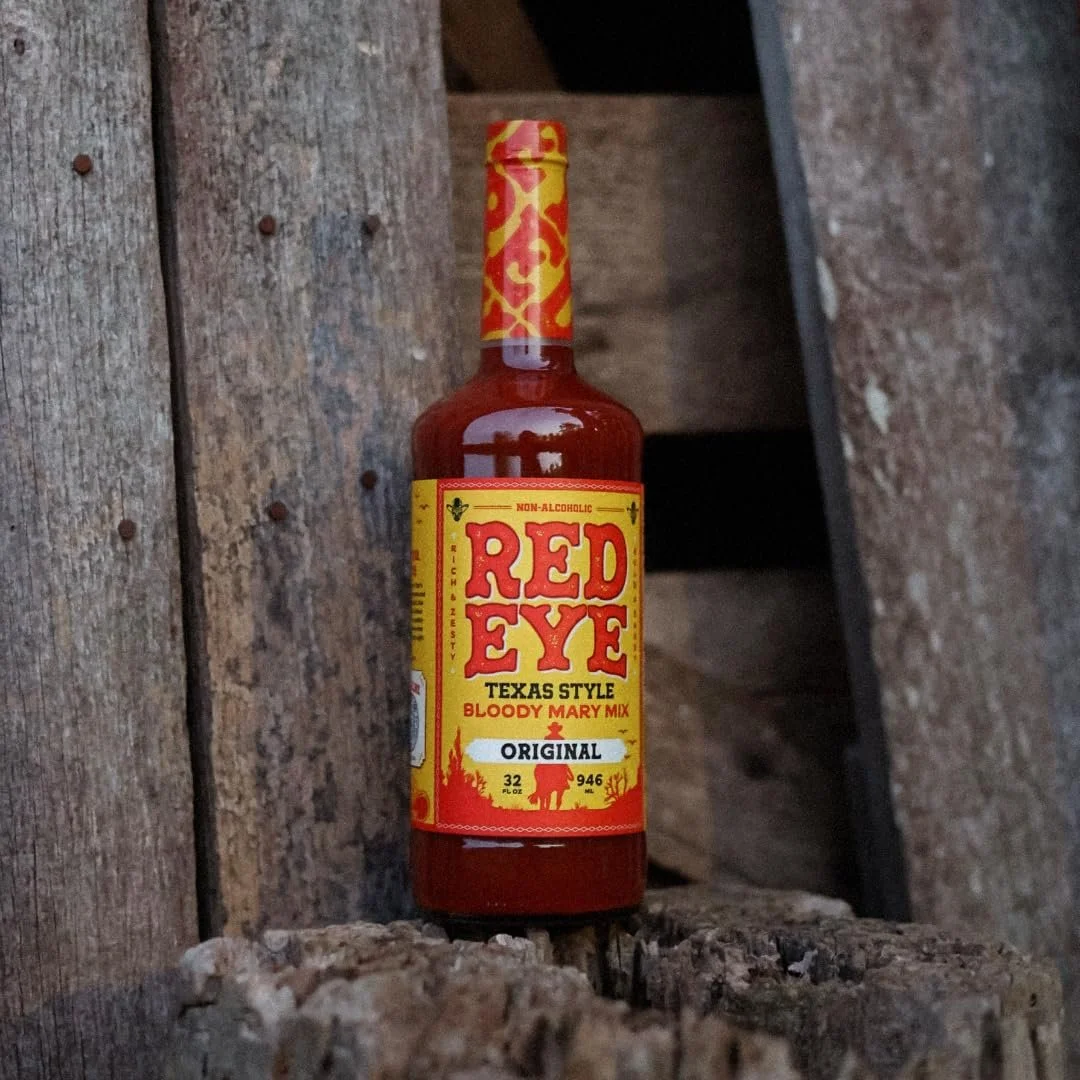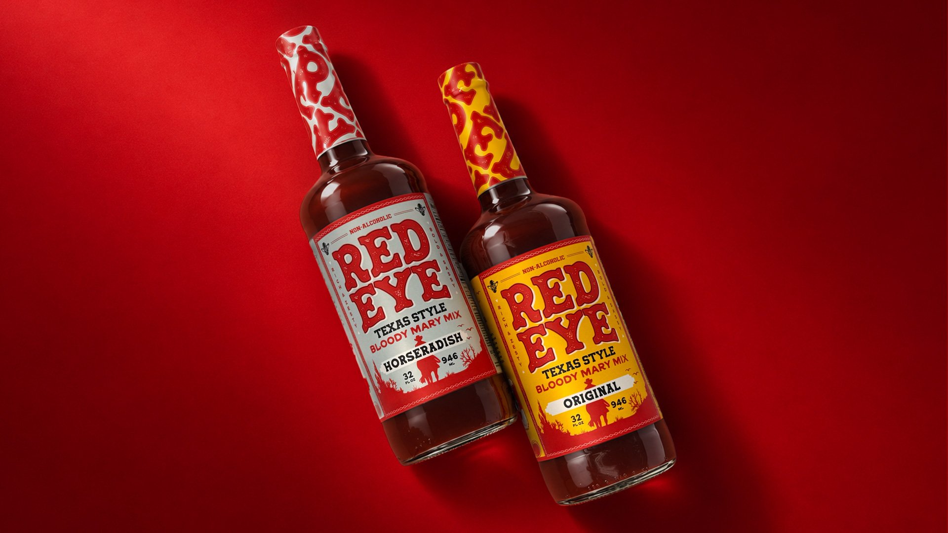
Giving a Texas original some much-needed bite.
RedEye already had the good stuff: a bold name, a cult-worthy recipe, and a distinctly Texas point of view. What it didn’t have was packaging that made any of that obvious from the shelf.
RedEye Bloody Mary Mix
Year: 2025
Industry: Food & Beverage
Client: R.S. Lipman
Services
Research & Strategy
Brand Identity
Packaging Design
Copywriting
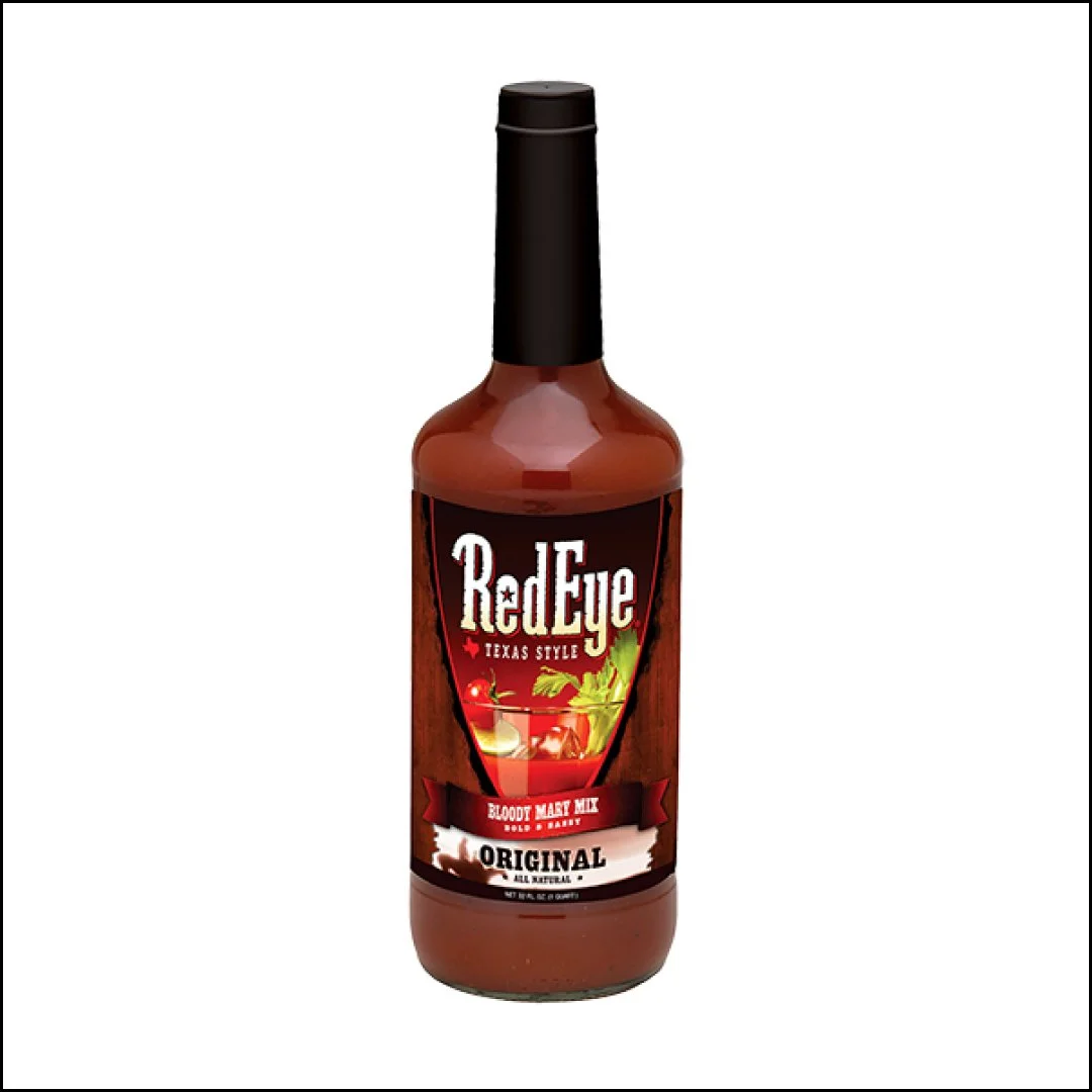
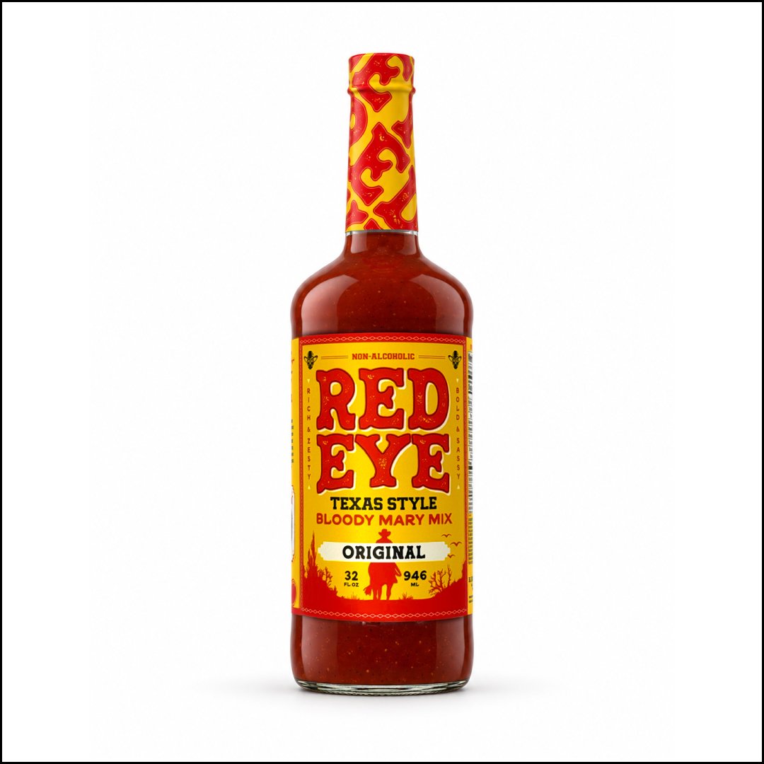
Before
After
The Problem
RedEye’s existing packaging undersold the product inside. In a category crowded with personality, the label felt dated, visually fragmented, and easy to overlook. The opportunity wasn’t to reinvent RedEye, but to turn up what was already there.